Red Lobster Rebranding
Brand Identity Study
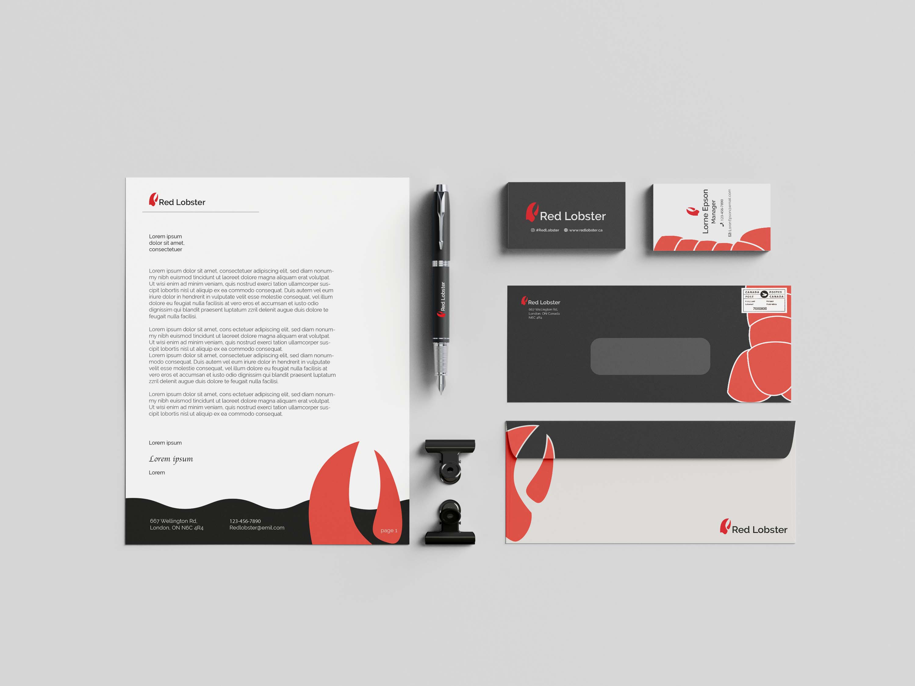
This Red Lobster rebrand focuses on building a cleaner and more flexible visual identity. Centered around the lobster claw as the main recognisable element, the system extends across logo design, typography, colour, signage, and branded applications to create a more cohesive and contemporary brand experience.
Rebrand Materials
Style Guide
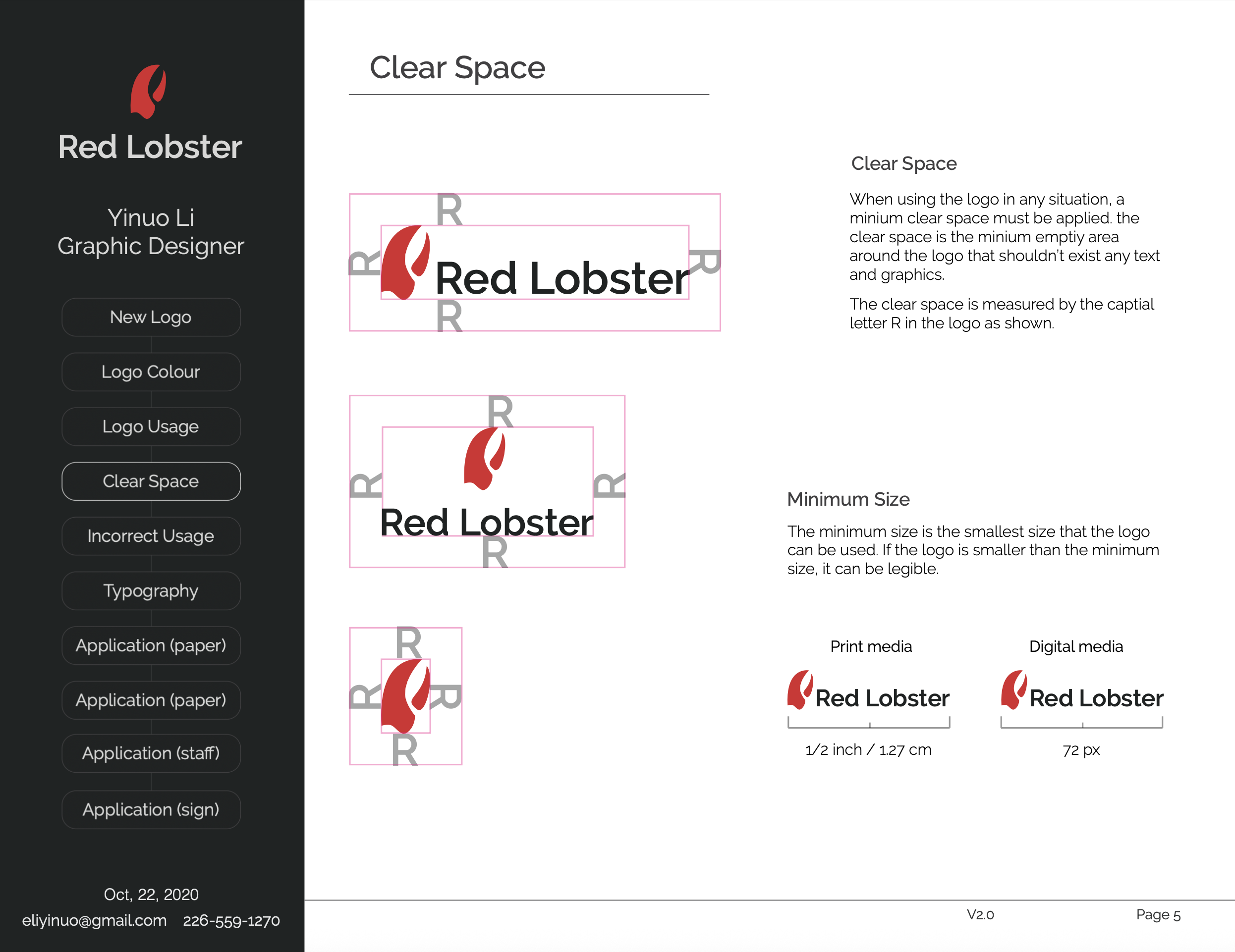
This style guide defines the core visual system of the Red Lobster rebrand, including logo usage, colour palette, typography, spacing, and application rules. It was developed to ensure consistency across both print and environmental touchpoints, while giving the identity enough flexibility to work in modern, fast-paced brand contexts.
Branded Mockups
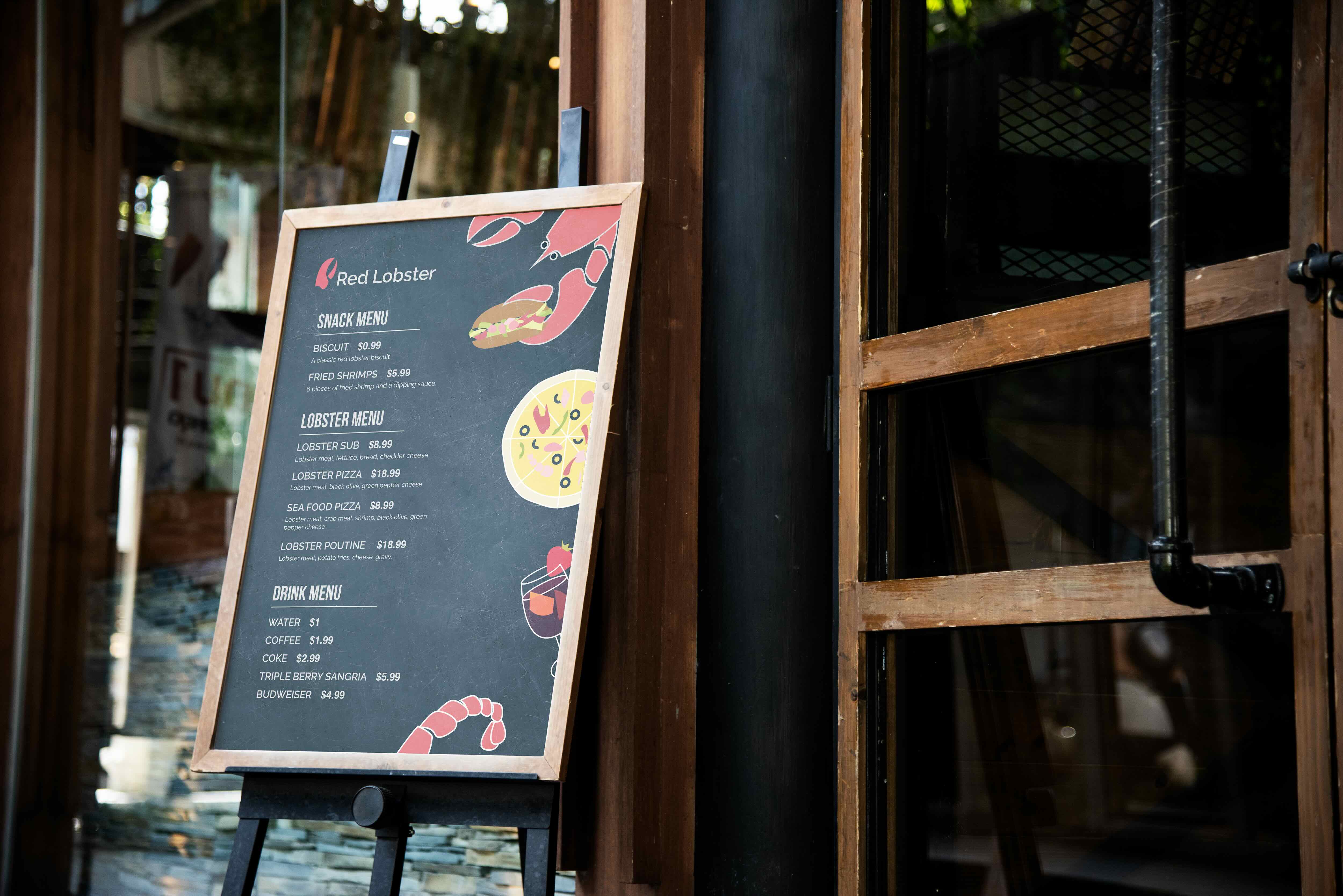
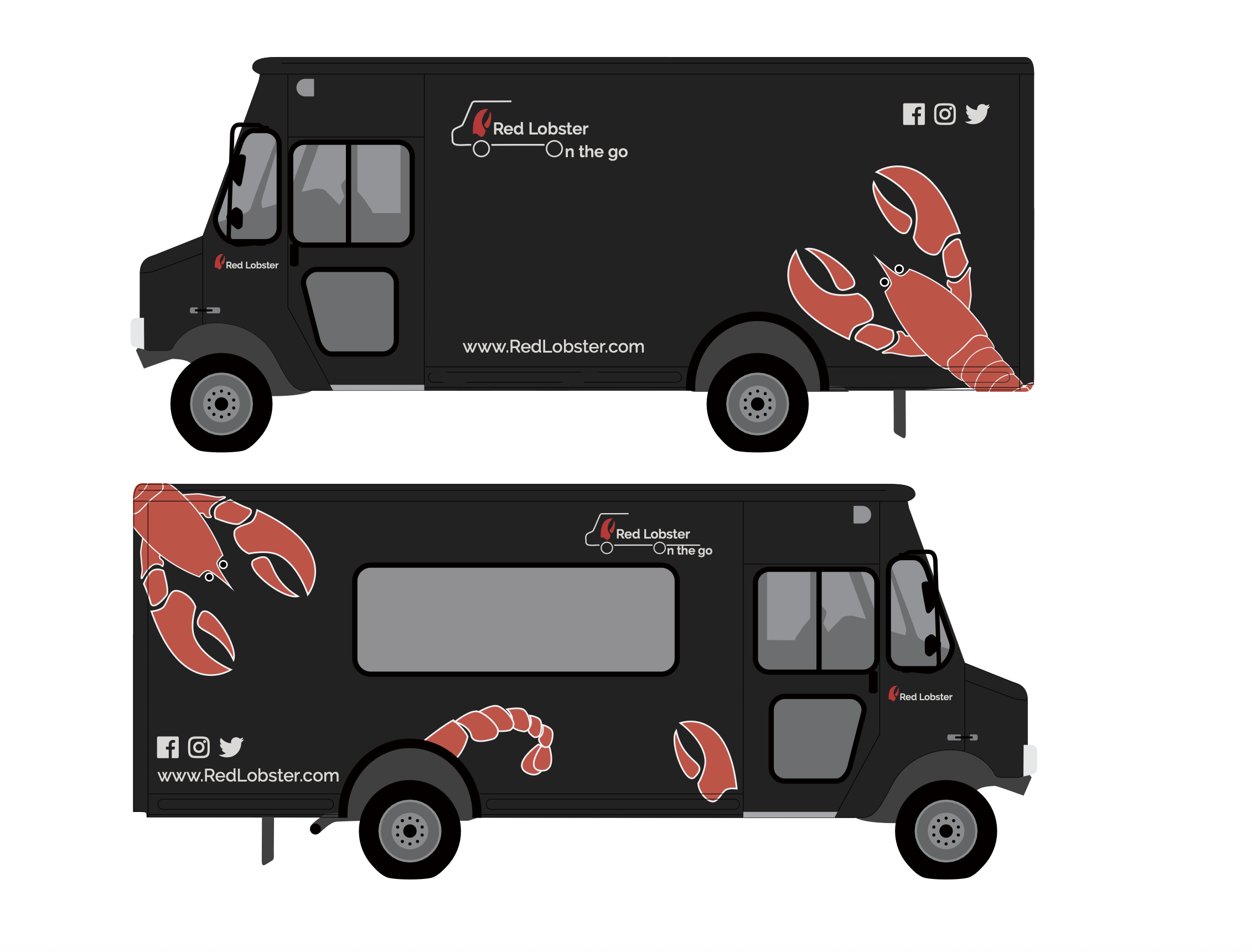
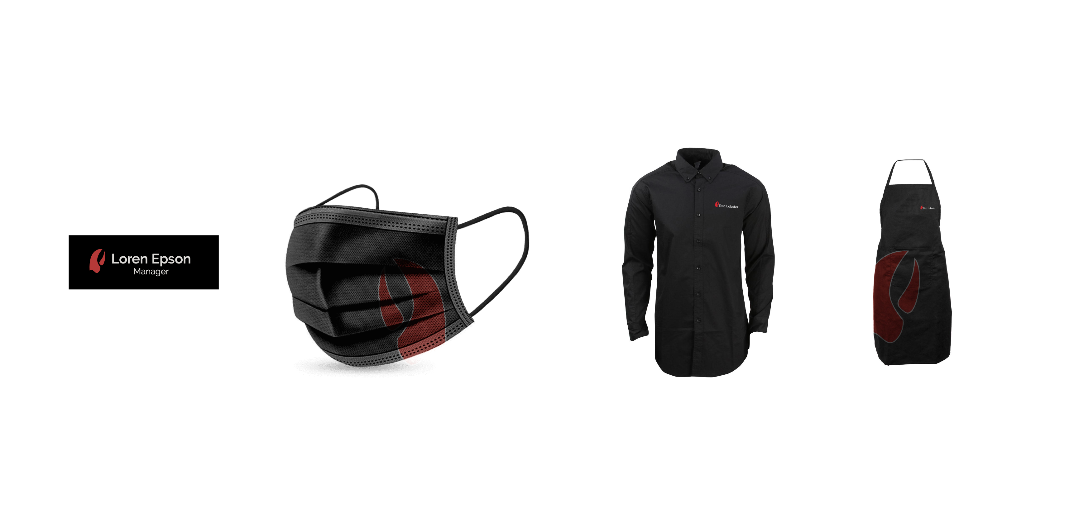
The mockups translate the identity into real-world applications such as stationery, staff items, signage, food truck graphics, and menu boards. These pieces were designed to show how the rebrand could function across customer-facing and operational touchpoints, creating a cohesive and recognizable experience beyond the logo itself.


See my work
Here are a few of my other projects. Feel free to explore.